Editing: The Dark Art
For some, editing film and video comes easy, naturally, as if the editing gods possess their mouse clicks and control their keyboard shortcuts to magically whittle hundreds of hours of footage down into mere minutes of genius.
Then, there’s the rest of us.
You might already be a great editor. Yes? Then you should be soooo happy for you.
If not, maybe you have a best friend or romantic counterpart who is an editing genius and will gladly toil for hours on your passion project or pitch tape idea.
Or, maybe you’re flush with cash and can spend $100 to $300 an hour on a great editor who will polish your project to a sheen.
None of those things true for you?
Then you’ll be editing your project yourself. Daunting, given this simple truth:
Most People Edit Lousy Tapes
And by lousy, we mean most people who attempt to edit their own projects fail miserably.
All caffeined-up, they hop into iMovie, start hacking and stitching scenes together, use cornball transitions, even cornier music, then add graphics that look like they didn’t quite make the cut on the local cable access channel.
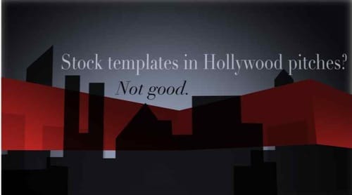
Please don’t use stock templates like the one above (Skyline Open.HD from Final Cut Pro) for your titles and graphics in anything you ever make. Your tape will look like dozens of others.
Worse, it will feel cheap, generic, and fail the Hollywood sniff test.
And by the way, if you’re going to use a scene transition other than a straight cut, please have a damn good reason to do so.
Do you honestly think James Cameron ever said, “You know, this scene could really use a checkerboard wipe…”
You will never make these mistakes. In fact, you’re about to become a better editor than more than 90% of your competition by following this…
Super Secret Editing Trick
It’s not a hard trick, in fact, this trick is based on something you did in pre-school.
Ahh, kindergarten. Tracing pictures while kids pronounced my name “Bingo” or “Bozo”–good times.
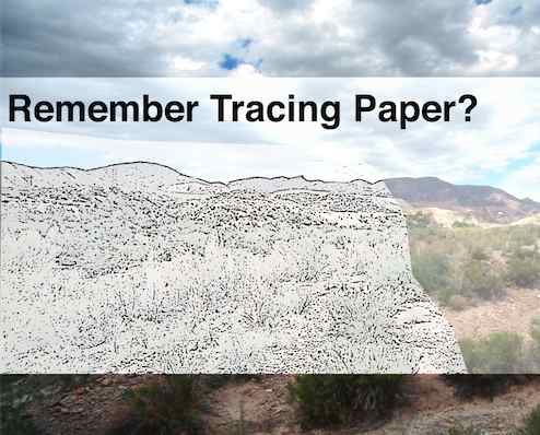
Remember tracing? When you’d put a piece of thin paper on top of a picture you wanted to draw and then trace it?
Same principle here:
Find a perfect example of the kind of piece you’re editing, and copy it, frame for frame — but replace their footage, music, and graphics with your own.
In other words, use the great video you’ve found as an exact template for your project.
Kind of like using those awful templates everyone else is using in iMovie, except your template will be of a much higher caliber.
Unlike those goofy packages aimed more at corporate videos than indie filmmakers, these “template videos” you’ve chosen by hand will make your pitch tape feel like a real, Hollywood-worthy project.
Isn’t that stealing?
Nope.
Here’s why: by the time you finish, your project will look nothing like the one that inspired you. In fact, you’ll find you can’t make a “perfect” copy of your template video while editing your unique idea no matter how hard you try to force it.
Your music will have a different timing. Your footage will call for longer or shorter cuts. Plus, you’ll come up with new ideas for your edit along the way that will morph your piece into something totally different.
The great thing is that those new choices you make will come from an educated place — knowledge you’ve earned by studying, dissecting, and mimicking a great reference video.
What you’re really doing here is learning the editing language that works for the kind of piece you’re creating.
Example: Movie Trailer
Cutting a movie trailer for your indie horror film? You could do a lot worse than mimicking this trailer from The Exorcism of Emily Rose:
Count the number of frames between cuts. How long do the different shots last for? Are some longer than others? Why?
Notice how sound effects and overall sound design play a huge role?
Transitions? Simple cuts, dissolves, and some fades to black or to white.
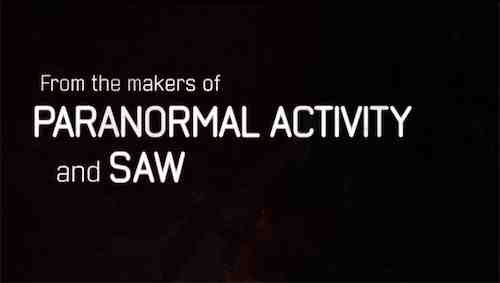
And how about the trailer’s graphics? Other than the subtle black rays, the title cards are basically a black serif font similar to Times New Roman on a white background.
When you think about it, most movie trailer graphics and title cards are actually pretty simple, right?
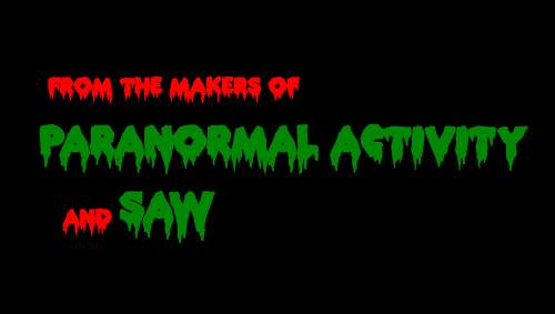
A movie trailer text card is much more likely to look like this:
Than this:
Why do people insist graphics like the red and green mess above feel cinematic? About 10 million filmmakers on Youtube seem to think so.
Yet this is exactly the kind of over-the-top, silly graphic we see again and again in tapes that get pitched to us (most often with great pride!)
Example: Reality TV Pitch
Getting ready to pitch us your reality TV idea or documentary series? No idea how to make a tape to sell your show? Already went through our epic guide How to Pitch a Reality Show?
Start by figuring out what television network might buy your show. (You ARE doing your homework and watching shows on television, right?) For instance, is your idea something that might feel like Pawn Stars on History Channel?
Then…what about choosing a reference video like this series teaser for Pawn Stars on History Channel:
Even if your editing skills are at the hobbyist level, there’s not much in the above tape you couldn’t pull off yourself as long as you take your time and make sure you get it right.
Look at how pacing, music, and voice over give the viewer an understanding of what the characters who run the Pawn Shop are like, how they’re related to each other, and the kind of drama you might expect to see from week to week.
How are sound effects used? Why are there “whooshes” on certain camera moves?
Is the person talking always the person you see on screen?
What’s the mix of footage? (There’s scenes, interview bites, and even some stylized b-roll and hero shots edited together in there, right?)
As for graphics, other than the 3d Pawn Stars logo (which the tape doesn’t need to prove this is going to be a fun show) the graphics are minimal.
So, let’s say you happened to find a family that hunts Alligators in the south and want to edit a tape about them to try to sell to History channel. Just start sliding your family of gator hunters footage in to the Pawn Stars framework. Use different, appropriate music, and you’ll be off to a great start.
Make an Editing Swipe File
Copywriters do this ALL THE TIME.
A “swipe file” in copywriting terms is a collection of articles and headlines marketing mavericks look to for inspiration.
(For more on this and al things copywriting, go live with Brian Clark at Copyblogger for a good, long time. Copyblogger may be our favorite blog ever.)
Same principle applies to your editing. Before you snuggle up to your Final Cut Pro bay to make your new TV show pitch, movie trailer, action scene, romantic comedy or entire documentary, put together your editing swipe file. Collect ten, twenty, thirty examples of edited trailers, scenes, or videos you’d like your project to feel like.
Then pick just one and mimic it exactly.
Some Crusty Old Hollywood Advice
A crusty old producer once told us that another crusty old filmmaker had passed on this advice, which he supposedly heard from a really, really crusty marketing man years and years ago:
If you’re gonna steal, steal from the best.
So go find the very best example of what you’re trying to accomplish on YouTube, mimic it, and then improve on it.
Your Thoughts?
What do you think? Gonna build your own editing swipe file? Too offended by the idea to even try? Have your own editing tricks to share? Lay it on us in the comments below.
